
Building a Purple Palette for Dairy, Drinks, and Plant-Based Foods
Purple is having a moment on shelves. Ube lattes, berry yogurts, and violet sports drinks all rely on a shade that looks fun but also fruity. For brands that want that look from plants, elderberry color is a familiar starting point, though rarely the only one. A good purple palette usually combines several sources, each chosen for a particular job. This article walks through how formulators think about those choices across dairy, beverages, and plant-based foods. Let us start with the basics.
Why Purple Is Tricky
Purple sits between red and blue, so any drift pulls it one way or the other. Too much red and a grape drink looks like cherry. Too much blue and it looks like medicine. Natural pigments add another layer, because their shade depends on the food around them. That is why a color picked from a swatch book can look different once it is stirred into a real recipe. Testing early removes much of the guesswork. It is worth the effort.
Fruit-Based Sources
Elderberry, along with other dark berries and fruits, delivers a deep reddish purple with a natural, fruity feel. Consumers recognize these ingredients, which fits clean-label stories. The shade tends to lean toward red in acidic foods, so it suits berry flavors very naturally. Strength varies from one product to another, so check the concentration and dose accordingly. In general, fruit-based purples are a good match when the flavor and the color should tell the same story to the shopper. Keep it simple.
Root-Based Sources
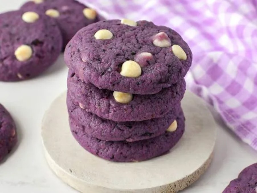
Purple roots take a different path. Purple sweet potato, for example, brings anthocyanins with notable sturdiness, and the shade can lean toward blue-violet. Searching for purple color for food usually leads to options like this, since they reach cooler tones that berries struggle to hit. Roots are often a good choice where heat, baking, or longer shelf life matter. They can also be paired with berry extracts to tune the final tone. Test a few grades side by side before you choose one.
Dairy and Yogurt
Milk-based foods sit close to neutral in pH, which pushes many anthocyanins toward blue and gray. Yogurt is more acidic, so purples usually stay brighter there. Fruit preparations are often colored separately and swirled into the white base. Add the color before or after pasteurization depending on the pigment’s heat tolerance. Look at the finished container a few days later, because proteins and light can slowly alter the shade. Small trials in the actual base are the safest guide. Keep notes.
Beverages and Hydration Drinks
Drinks offer a clean canvas, which makes any color flaw obvious. Clear bottles also allow light to reach the pigment, so protection matters. Most beverage pH levels suit purple fruit and root colors, but sweeteners, minerals, and added vitamins can nudge the result. Make a small batch of the exact formula, then store samples in the light and in the dark. The comparison shows how much shelf life you can safely claim on the label. Please do not trust a single photo.
Plant-Based Foods
Plant-based products often start with a dull, beige base made from pea, oat, or soy. That base absorbs light and can mute colors, so you may need more pigment than expected. Frozen desserts, vegan cheeses, and fruit-flavored alternatives all benefit from purple, but each has its own pH and fat level. Adjust the dosage in steps and judge the color after the product has set, chilled, or frozen, not while it is still warm and wet. Patience helps a lot here.
Blending for Balance
Professional color work rarely depends on one pigment. A touch of a blue source can cool a purple that turns red, while a small red addition can warm a tone that feels too icy. Keep notes on every ratio, and change only one element per trial. Over time, you build a small library of tested blends. That library saves weeks later, when marketing asks for a slightly different violet for a seasonal launch. It also helps new team members learn the rules faster.
A Shade Worth the Patience
A good purple takes patience, but the payoff is a product that looks as playful as it tastes. Start with the base food, choose sources that fit it, and test under real conditions. For samples across fruit and root colors, plus formulation help for your own recipes, explore foodrgb.com and see which tones suit your range. A short conversation with a technical team can shorten the path to a final shade. Purple should feel exciting for you and for shoppers alike.


